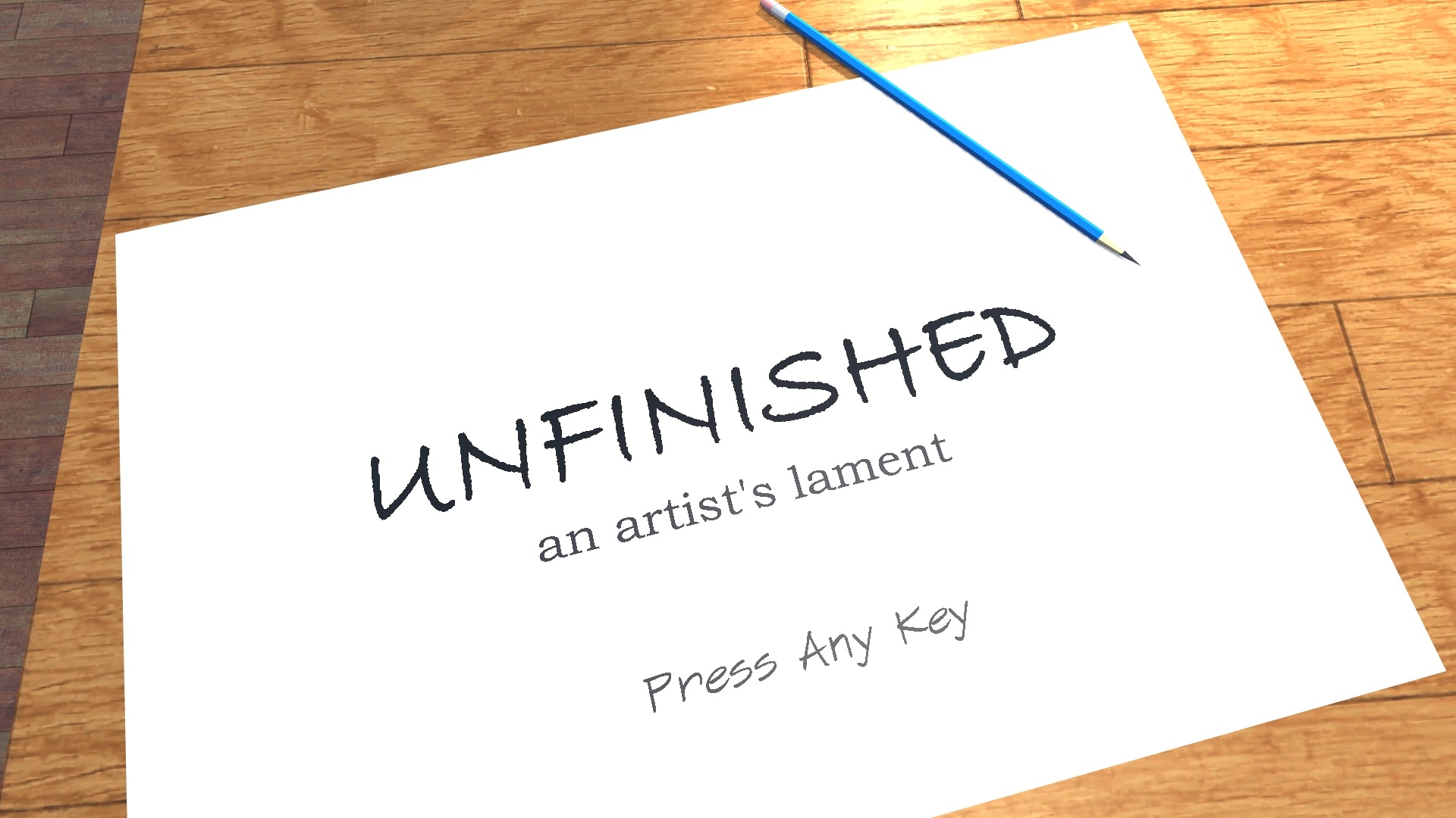
I’ve released two indie games in the last year: “Drew and the Floating Labyrinth” and “Unfinished – An Artist’s Lament.” I’ve taken (and helped teach) University classes in game design. I have a large collection of games, some played and some not, but am familiar with their advances and can point out good and bad elements in each. All together, I think I have a good understanding of good practices in game design and making a fun and/or meaningful experience.
However, understanding is different from doing. While some players do appreciate my games, they have many flaws that have been pointed out. The gravity of these flaws on the overall experience would be lost on me had I not released my games to the public and received feedback. So in this post, I’ll go over some of the lessons I’ve learned in how NOT to do game design, using my games as examples. I hope this will be useful to me in the future, and I hope it provides insight to new indies and students as they build their first games.
Lesson 1: “Show, Don’t Tell (but tell at the beginning)”
One of my pet peeves, and that of many other gamers I hear online, is that some games will hold your hand throughout the experience, reminding you which buttons to press and where to go. The art of the game is the ability to learn the rules yourself and play accordingly, and it isn’t as fun when a voice keeps telling you in your ear what move to make. I especially appreciate how some games don’t tell you anything at all, letting you “discover” the game as it reveals itself to you (the classic adventure game “Myst” was notorious for this, among other older adventure games I remember).
However, it is possible to go too far in trusting the player. In all of my games so far, I designed the beginning around this concept of being dropped in a unfamiliar world and not telling the player what to do next. This made the game all the more abstruse, causing most players to give up immediately, and some to not understand some of the game mechanics.
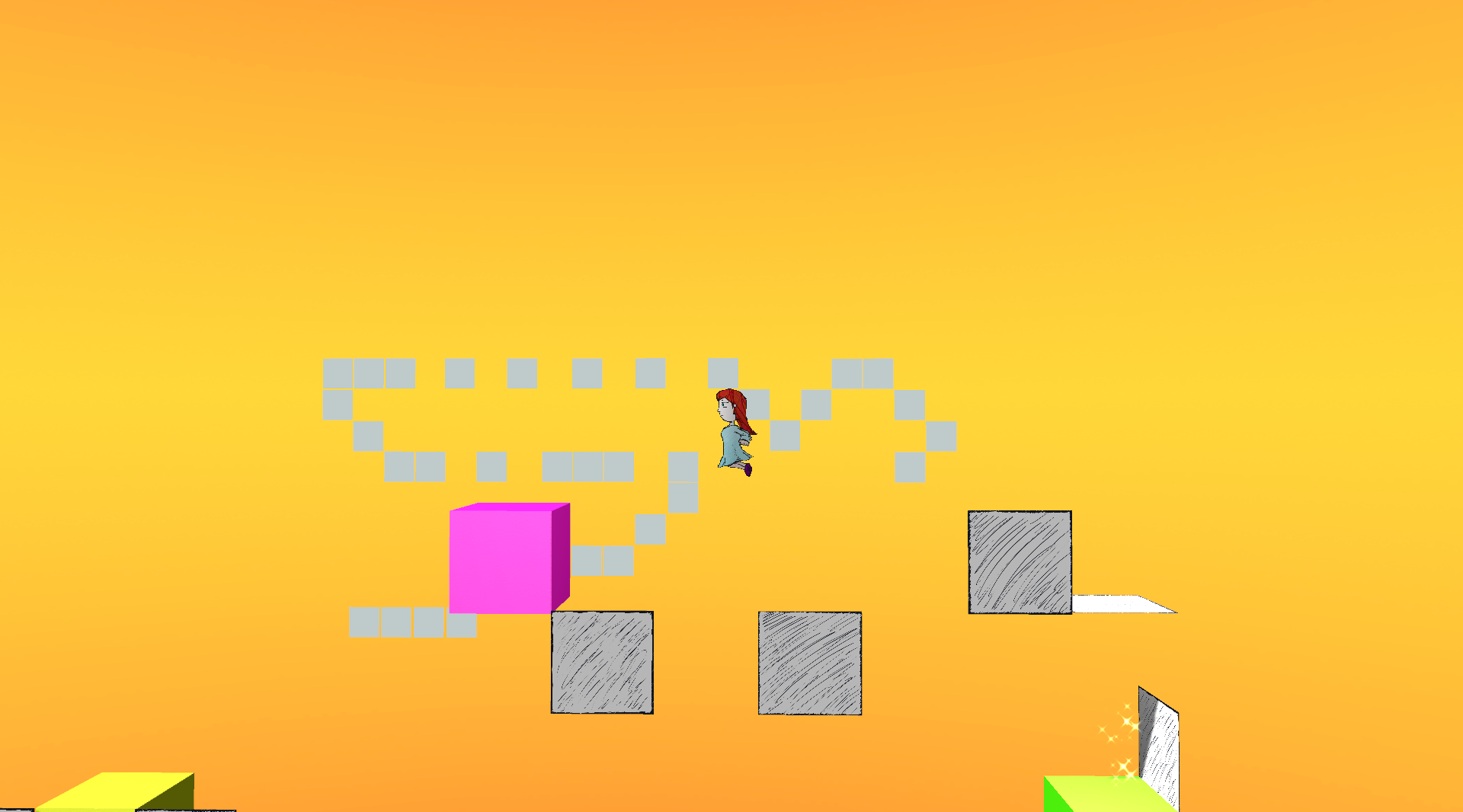
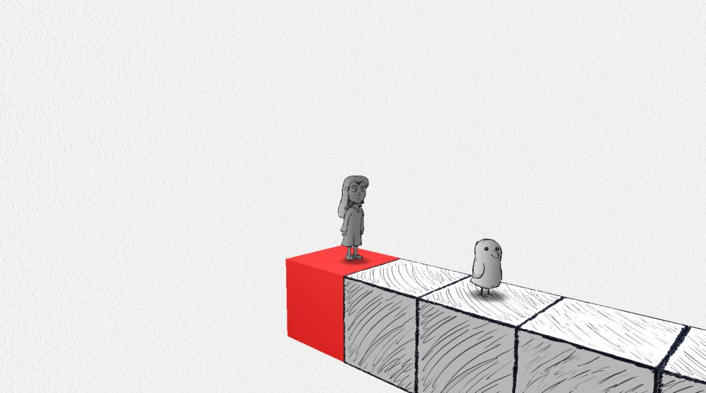
In “Drew and the Floating Labyrinth,” the game starts with a girl standing on a red block, with a green block in the near distance. Using typical platforming controls, you can walk and jump, but doing do shows you can’t jump far enough. I have a giant block far below that suggests that there is a “clue” around the block you are standing on, but what that clue means is left for you to figure out. What I intended was for you to walk along a hidden path revealed by following the direction of the clues. Watching gameplay videos shows many players just jump randomly to their deaths until they find part of the path to save them.
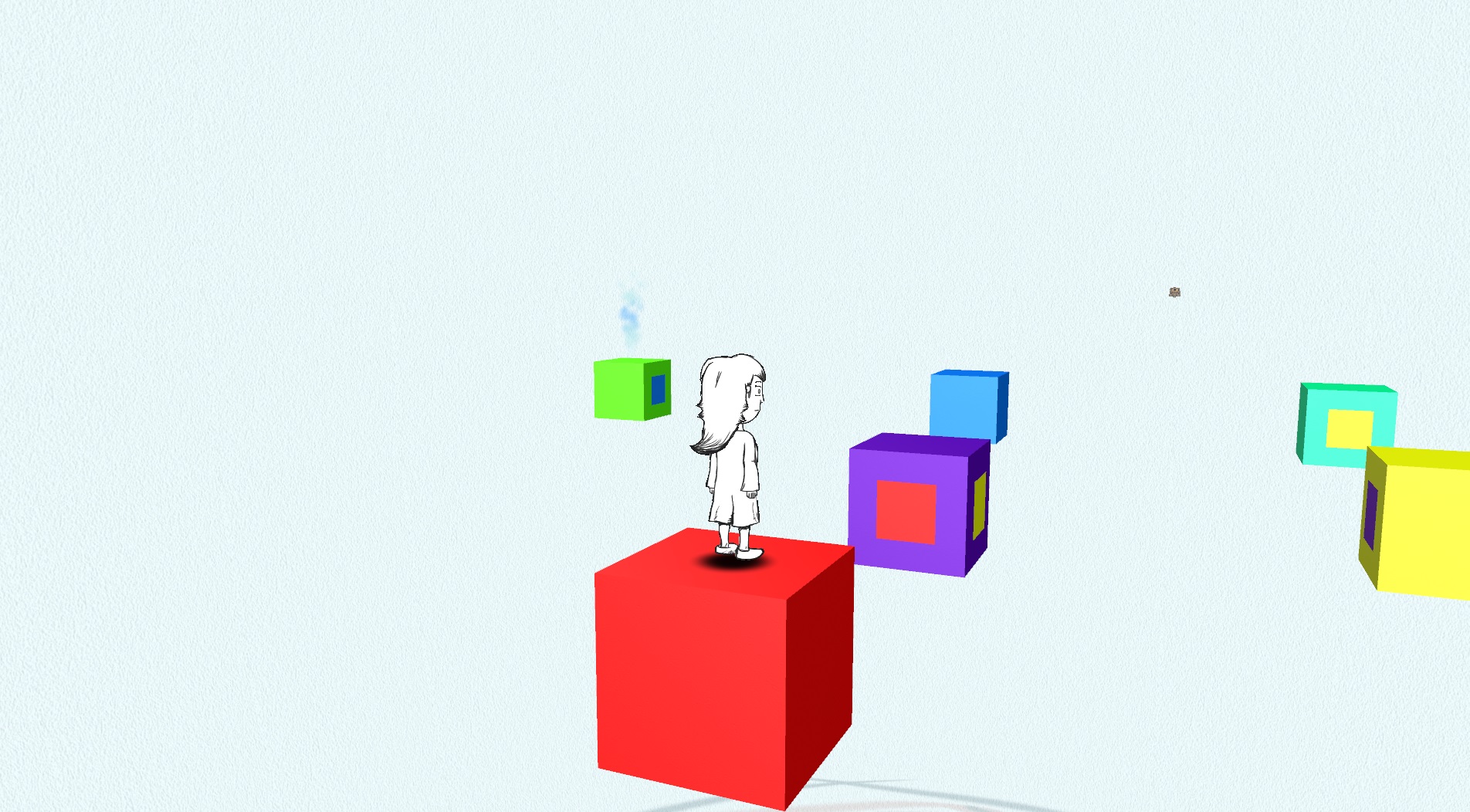
Drew in the middle of nowhere…
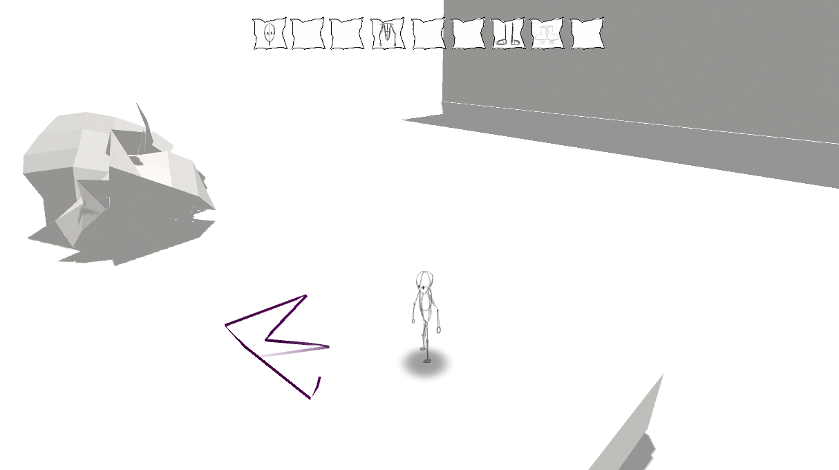
In “Unfinished – An Artist’s Lament,” I start players off in a similar fashion. After a cutscene, you are in a white empty space. The only thing in a pencil drawing away from you. No platforms, no text, no clues. No controls other than walk. The intention was for you to go towards the pencil, since there’s nothing else you can do. Once there, you get stuck, until you realize that the pencil is a video on a wall (revealed by rotating the camera and seeing the shadow on the other side), and after walking around the wall you see the level for the first time. It’s a great moment, but after watching testers try out the game, I added clues (both audio and through a ‘thought bubble’) to tell the player to literally go around the wall. Despite listing controls in a pause menu, and having a UI that says the pause menu can be accessed with the ESC button, many players still had trouble understanding abilities later on in the game.

Nothing but a pencil in the distance. Maybe… go towards the pencil?
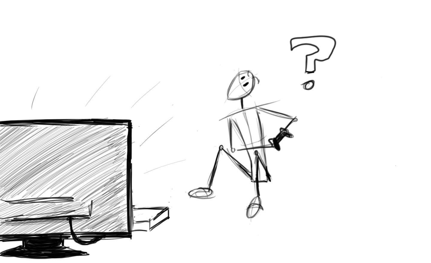
These design concepts were very deliberate. Even in my first public project “James – Journey of Existence,” you started on a platform in midair, with no warning that a moving platform came down periodically from above. I love the idea of seeing the game world for the first time, interacting with it and learning as you play. Most modern players don’t have time for that. While it was against my thoughts of game design (and thus I never added it), the most requested feature of my games was to add a tutorial level.
James looks very nice standing there, but where does he go?
So in future games, I hope to make important gameplay concepts like this less obtuse. I will add prompts at the beginning telling you to use the arrow keys to move. I will use prompts to explain new mechanics when they first appear. I will have a prompt that forces you to open the pause menu once to know where it is. Some games I’ve played have done this, and I hate it, but maybe it’s necessary. If you don’t want your game to be exclusively in a single language, you may want to use visual prompts and simple starting examples, but this is easier said then done.
I might be too cynical here. The goal of any game is to be accessible to everyone. For players who have never seen your game before, you need to make the game ‘child-proof’ at least at the beginning, only letting go of their hand later when you are certain they are ready.
Lesson 2: Fix Those Controls
The controls in my games are awkward at best. I know this, but after being used to them during testing for so long, they seem no worse to me than the controls in other games. This can be a problem, especially since my games relied heavily on platforming. I was aware of this, and made the game not rely on timing and precision where I could help it, but feedback from gamers made it clear.
So one of your top priorities should be making your controls feel right. Make them sing. Make them feel as natural as breathing. Some genres will place less importance on this, but generally you want them to be as intuitive and responsive as possible. Assume most players won’t read your manual and jump right in, if your controls are unusual, see Lesson 1.
Platforming isn’t as much fun if the jump button is weird,
This isn’t easy after playing the same game for months on end, so ask friends for feedback. Even better, play similar games and see what they did right (or wrong). I spend a lot more time making games then playing them, which seems a terrible fallacy. Take the time to play a game every week or so. Call it ‘research.’
Another aspect for PC gaming: players insist on customizable controls, otherwise many will give up on the spot. Unity3D’s default control menu works, but requires you to set the controls before starting the game, and is limited in flexibility. In future games I will try to build my own proper menu for controls within the engine, but you may find other existing options from other programmers. The importance on this is greater than you think, so don’t leave it out.
Lesson 3: ‘Annoying Navi’ Syndrome
Certain lore of gaming culture is well-versed among its community. One is the Legend of Zelda games (specifically Ocarina of Time), where an infamous fairy named Navi acts as guide during your quests. By which I mean she keeps telling you in your ear what move to make. For this she has been described as “the first annoying video game character.”
What we learn from this is be very careful when you consider Lesson 1. But there are other ways to annoy your gamer. For me, I commonly loop the same music track over and over again. The music I’ve gotten is beautiful, most players agree, but when hearing the same 1-minute track cycle for the tenth time during a level, most players also agree to turn off the audio. Similarly, another issue I’ve had was through voiced characters that repeat a sound every minute or so to remind the player what to do.
Do you remember who that bird really is? Most don’t, they quit after hearing his voice 42 times…
For music, perhaps it is better to simplify the tracks as much as possible to not be in the way, only keeping the beautiful moments during singular moments of the game. For voice overs… I don’t know what to do. I included code to make them appear less often as the level continues, but I’ve still heard complaints. For my games, where patience and thinking and part of the gameplay, gamers can beat a level within seconds, or within several minutes, and that huge discrepancy makes it difficult to plan these elements accordingly.
Anyway, the point is to get feedback about annoying elements. If possible, reduce them or even consider removing them completely. Your players will be grateful.
Lesson 4: Don’t Break Game Flow
While most players disagree, I am very proud of the main menu design in my games. So much so that between each level, I cut back to the main menu for the player to select the next stage. Gamers were not pleased.
There were reasons why I did this. In “Drew and the Floating Labyrinth,” I made level completion optional to move on to further levels. In “Unfinished – An Artist’s Lament,” I made subtle changes to the desk the menu is on to show progression in the story, inspired in part by thatgamecompany’s game “Flower.” But players complained anyway, enough so for me to update “Unfinished” to allow playing the full game without this interruption.
This start menu looks nice, but you shouldn’t have to see it after every level.
And that’s what it was: an ‘interruption.’ Whatever my reasons, it broke the game’s flow, adding an extra step for people who just wanted to play the game. Breaking to the menu is one example, but extensive cutscenes and tutorials can also cause the same effect. Be careful of this when designing your game. You want your players to play, and should remove anything that gets in their way.
Lesson 5: Need… More… Content…
I like short games. I do appreciate 60+ hour RPG’s, but I rarely have the time to finish them. Better are the games that can be completed in a day, but are fun to replay over and over again.
And so my games are quite short. In fact, both of my two games could easily be beaten in under an hour. But preferring short games can be a poor excuse, especially when I’m charging money for it. Some games can justify this, but gamers don’t care for the reason, they just want value for their money! And they should get it.
I didn’t add more levels/story to “Unfinished,” but I did add an update for new collectables.
It’s up to you how you add more content. You can lengthen the game (at risk of feeling like padding). You can add multiple endings or paths for replay value. You can add collectables and achievements. Ideally, add optional content so someone can ‘beat’ the game quickly, but can get more out of it with more time.
Or you could just make the game really fun and worth playing again.
—-
Okey-dokey, I think that’s my lesson for today. I hope future me will use these concepts in the test coming up in 4-8 months, and I hope you learned something to! Did you learn anything from your experiences in game development?